
Color Rendering Index, or CRI, is a 0 to 100 score that measures how accurately a light source reveals the true colors of objects. A higher score means your interiors look more vibrant, more natural, and closer to how colors appear under a reference light such as daylight.
You know this problem if you’ve ever picked the perfect paint swatch in the afternoon, only to see it turn muddy at night. Or you’ve installed new pendants over an island and wondered why produce looks flat, wood tones look lifeless, and everyone’s skin looks a little off. In my years in this business, that disconnect usually isn’t about style. It’s about color quality.
Most homeowners shop lighting by shape, finish, brightness, and warmth first. Those all matter. But if the light can’t render color well, even a beautiful fixture won’t make the room feel finished. The sofa fabric won’t read the way you expected. The stone countertop can lose depth. A carefully layered room can suddenly feel cheaper than it is.
That’s where understanding what is color rendering index in lighting becomes useful, not as a technical exercise, but as a practical design tool. CRI helps you predict whether light will flatter your materials, your finishes, your food, and your everyday routines.
Your Guide to True Color in Home Lighting
A homeowner spends weeks choosing white oak flooring, a creamy wall color, and brushed brass hardware. The room looks balanced in samples and showroom lighting. Once the fixtures are installed, the brass feels dull, the oak reads ashy, and the wall color leans wrong. The instinct is to blame the paint or the fixture finish.
Often, the main issue is the bulb.
As a COO, I see this from the top down. We can invest in great silhouettes, strong materials, and thoughtful engineering, but the room still won’t land if the lamp inside the fixture renders color poorly. Good design needs good light to be seen clearly.
CRI is the shorthand for that color accuracy. It tells you how faithfully a light source reveals the colors in your home compared to a reference illuminant such as daylight or incandescent light. When the score is higher, reds look richer, woods look more honest, and layered interiors feel more intentional.
Why homeowners get tripped up
Three separate ideas are often confused:
- Brightness: How much light you get.
- Warmth: Whether the light looks warm or cool.
- Color rendering: Whether the light shows objects accurately.
You can have a bright room with poor color rendering. You can have warm light that still makes food or skin tones look off. That’s why two spaces with similar fixtures can feel completely different.
Good lighting doesn’t just help you see. It helps you see your choices correctly.
The financial side matters too. When lighting renders color well, your finishes work harder for you. Paint, tile, art, upholstery, and natural wood all read as intended. That protects the value of the design decisions you’ve already paid for.
Decoding the CRI Scale What the Numbers Really Mean
The formal definition is straightforward. The Color Rendering Index measures how faithfully a lamp reveals color compared to a reference source, using a 0 to 100 scale, where 100 is a perfect match. The general CRI score, called Ra, is the average of eight pastel test color samples, R1 through R8. For everyday use, 80–89 is considered good for general living areas, while 90–94 delivers the more vibrant color quality many homeowners want in higher-end interiors and hospitality settings, as described in the CIE-based CRI overview.

Think of CRI like photo quality
Here’s the simplest analogy I use with homeowners. Think of your room as a photo.
- Low CRI is like a badly edited image where color looks faded or strange.
- Mid-range CRI is usable, but not flattering.
- High CRI is the version where texture, undertone, and depth finally come through.
This is why a navy sofa can look flat under one lamp and luxurious under another. The furniture didn’t change. The light did.
A practical way to read the scale
CRI 0–50: Colors can look heavily distorted or hard to distinguish.
CRI 50–80: Colors are visible but often lack richness and accuracy.
CRI 80–89: Good everyday performance for many homes and offices.
CRI 90+: True-to-life rendering that supports strong interior design.
What each range feels like in a real home
A number on a spec sheet only matters if you can connect it to daily life.
| CRI range | What you’re likely to notice | Best fit |
|---|---|---|
| Below 70 | Colors look dull, washed out, or lifeless | Utility areas, storage, parking-style applications |
| 80 to 89 | Rooms look decent, but some materials still lack depth | General living areas and standard residential use |
| 90 to 94 | Better skin tones, truer paint, richer woods and fabrics | Kitchens, baths, dining rooms, hospitality-style interiors |
| 95 to 100 | Near-perfect fidelity for highly demanding visual work | Art, medical, film, and very color-sensitive spaces |
The biggest confusion point is that “good” on paper doesn’t always mean “beautiful” in a room. An 80s CRI lamp may satisfy a basic need. It may not honor the design.
Why the score doesn’t tell the whole story
CRI remains a foundational metric, but it was developed decades ago and based on a limited set of mostly pastel colors. That matters because real homes aren’t built from pastels alone. You live with saturated textiles, warm wood stains, skin tones, greenery, food, artwork, and stone with subtle undertones.
That’s also why I encourage homeowners to learn the difference between a merely acceptable bulb and a well-specified one. If you’re already comparing warmth, our guide to choosing bulb color for your space helps clarify how color temperature and color rendering work together.
My recommendation
In residential spaces where appearance matters, the best approach is simple:
- Use 90+ CRI where people spend time up close
- Don’t settle for “good enough” in kitchens and bathrooms
- Treat low CRI as functional light, not design light
If you care how your finishes look, high CRI is not a luxury detail. It’s part of the design brief.
How High CRI Lighting Transforms Every Room
High CRI changes a home in ways homeowners notice immediately but don’t always know how to name. Rooms feel clearer. Colors stop fighting each other. Materials regain texture.

That shift has an emotional effect. A kitchen feels fresher. A bathroom mirror becomes more trustworthy. A living room starts to feel layered instead of flat. In my experience, this is where lighting earns its value. It supports function, but it also protects the mood of the home.
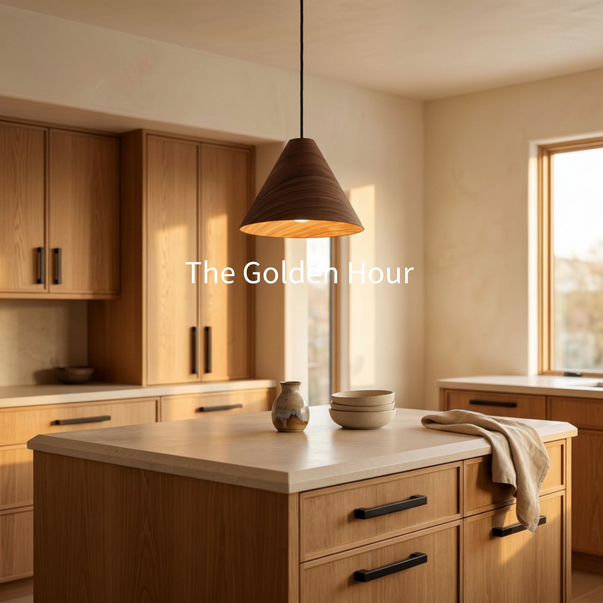
In the kitchen, color quality affects confidence
The kitchen is where poor color rendering gets exposed fast. Fresh herbs should look fresh. Raw ingredients should have clear visual distinction. Countertops, cabinet paint, and backsplash tile need to work together under morning light, midday use, and evening entertaining.
A higher CRI helps you judge what you’re preparing and what you’ve designed. White quartz looks cleaner. Wood grain looks warmer. Food looks appetizing instead of grayish.
If you’re using island pendants with recessed lighting, consistency matters just as much as the fixture style. Mixed sources with noticeably different color quality can make one end of the counter look right and the other feel off.
In the bathroom, honesty matters
Bathrooms are color-critical spaces. You shave, apply makeup, assess skin tone, and choose clothing under that light. If the source renders color poorly, the mirror lies.
This is one place where I don’t recommend compromise. The same warm finish that looks inviting in a bath can still fail if the lamp inside makes skin tones look sallow or cosmetic colors shift.
Pro-Tip
When you layer a bathroom with vanity lights, overhead light, and a nearby closet or hallway source, keep the color quality aligned. A room feels more polished when the light sources render color similarly, rather than making skin tones and finishes change from zone to zone.
Living rooms reward subtlety
Living rooms aren’t task-heavy in the same way kitchens are, but they reveal quality just as clearly. Upholstery, area rugs, books, artwork, and millwork all benefit from stronger color rendering.
High CRI often achieves its best results subtly. You may not walk in and say, “This room has excellent color fidelity.” You’re more likely to say the room feels calm, complete, and expensive.
For layered spaces, the method matters. Combining ambient, task, and accent light works best when those sources support one another. If you want a practical framework for that, our guide on how to layer lighting at home is worth reading before you finalize fixtures and lamps.
A short visual explainer can also help if you prefer to see the concept in action.
Bedrooms need flattering light, not just soft light
Many people focus only on a warm mood in the bedroom. Warmth matters, but soft light that renders color poorly can still make bedding, wall color, and wood furniture look muddy.
Good bedroom lighting should do two things at once:
- Support rest: The room should feel gentle and comfortable.
- Preserve material quality: Sheets, throw blankets, painted trim, and artwork should still read accurately.
A lamp can feel cozy and still be visually disappointing. Better color quality prevents that tradeoff.
Entryways and dining rooms set the tone
These spaces are often where guests form their first and strongest impression. If the entry feels dim and gray, or the dining room makes food and faces look flat, the home loses impact immediately.
High CRI pays off here because these rooms often feature finish-forward choices:
- stained wood tables
- decorative metals
- statement wall colors
- artwork
- floral arrangements
- layered textiles
When the light reveals those materials cleanly, the room feels intentional. When it doesn’t, the whole composition loses precision.
Outdoor areas deserve better than utility light
Patios, porches, and exterior entertaining zones often get treated as afterthoughts. That’s a mistake. Outdoor lighting with better color rendering helps greenery look healthier, architectural materials read more naturally, and transitions from inside to outside feel smoother.
It also helps when you’re moving between interior and exterior spaces at dusk. If the indoor light renders color beautifully and the exterior light flattens everything, the shift is jarring.
The practical takeaway is simple. Use stronger color quality where people gather, where decisions happen, and where materials deserve to be seen well.
CRI Compared to CCT and TM-30
A homeowner can choose a warm, inviting bulb and still end up with a room that feels a little off. The walls seem flatter than they did in the paint sample. Wood loses depth. Skin looks tired. That usually happens because two different lighting ideas got blended together.
CCT and CRI answer different questions. CCT tells you the color appearance of the light itself, whether it feels warm like candlelight or cooler and cleaner. CRI tells you how faithfully that light reveals the colors of the things you spent money on.

CCT shapes mood. CRI protects the design
I explain it to clients this way. CCT sets the mood. CRI reveals the truth.
That difference matters in real homes. A soft 2700K lamp may create the calm feel you want in a bedroom, and a resource on lighting temperature for a sleep sanctuary can help you choose that atmosphere. But that warm glow does not guarantee your bedding, paint, flooring, and furniture will look rich and accurate.
As a lighting executive, I see this mistake often in expensive renovations. Homeowners approve beautiful finishes, then install lighting that is warm enough but only average at rendering color. The room feels pleasant at first glance, yet never quite delivers the depth or polish they expected. That is one reason I push beyond "good enough" 80 CRI and recommend 90+ CRI wherever design matters.
Why TM-30 gives a fuller picture
CRI still has value. It is simple, widely listed, and useful as a first screen. But LED technology exposed a weakness in the older CRI method, especially when you are trying to compare modern products with subtle differences in color quality.
The traditional CRI method uses a limited set of test colors, so two lamps can post similar CRI scores and still render reds, wood tones, or skin differently. The CIE discusses that limitation in its commentary on the limits of CRI for white LED sources.
Because of that, lighting professionals often use TM-30 alongside CRI.
The IES TM-30-15 method evaluates light with 99 test colors rather than CRI's small sample set. It reports Rf for fidelity and Rg for gamut, which helps show whether a source keeps colors natural, dulls them, or pushes them too hard, as outlined in this TM-30 overview for LED evaluation.
What that means in plain English
TM-30 helps answer practical design questions that CRI alone can miss:
- Fidelity: How close are colors to the reference light source?
- Gamut: Are colors muted, balanced, or overstated?
That distinction has financial value, not just technical value. A fixture with mediocre color quality can make premium materials look ordinary. A better fixture can make cabinetry, textiles, stone, and art read the way you intended when you chose them.
My advice is direct. Use CRI as your first filter, and aim for 90+ in the rooms that carry the visual identity of the home. If TM-30 data is available, read it as the second layer of proof. CRI tells you whether the product clears the bar. TM-30 helps show how confidently it will perform once the room is finished.
Common Misconceptions About Color Rendering
A homeowner can spend serious money on tile, paint, cabinetry, and art, then watch the room fall flat under the wrong light. I see this often. The finishes are right. The fixture style is right. The color quality is what missed the mark.
Myth one that a 90 CRI lamp is always a safe bet
A 90 CRI label is a strong starting point, not a guarantee. As noted earlier, CRI has limits with modern LED products, especially when you want confidence in how richer colors will appear once the room is finished.
That gap matters more in homes than many people realize. Two fixtures can both claim 90 CRI and still treat skin, walnut, terracotta, or artwork differently. One makes the room feel layered and expensive. The other makes premium materials look strangely flat.
My recommendation is simple. Treat 90+ CRI as the floor in design-sensitive rooms, not the finish line.
Myth two that higher CRI is the only thing that matters
Color rendering is one part of light quality. Brightness, beam spread, dimming behavior, and color temperature still shape how a room feels at night.
Paint offers a useful comparison. You would not choose a wall color by swatch alone and ignore sheen, daylight, and the surrounding finishes. Lighting works the same way. A high CRI lamp in the wrong color temperature can still make a room feel cold, sleepy, or off-balance. If you are comparing lamp types, these bulb selection tips for matching function and mood can help you sort through the tradeoffs.
Myth three that CRI tells you everything about reds and skin tones
CRI gives you a broad summary. It does not tell the whole story for the colors people notice fastest.
That is why homeowners sometimes feel disappointed in bathrooms, kitchens, and dining areas even after choosing a product that sounded impressive on paper. Faces look tired. Wood loses warmth. Food looks less appealing. The fixture is technically acceptable, but visually underwhelming.
As a manufacturer and operator, I do not consider that a small miss. In a finished home, those subtle misses change the emotional read of the space. They can also weaken the value of the design choices you already paid for.
Reality check: If guests look washed out at the vanity or your cabinetry loses depth after sunset, the light source is part of the problem.
Myth four that outdoor fixtures don’t need good color rendering
Exterior lighting deserves more respect than utility-grade specs often give it. Your front door color, masonry, landscaping, and outdoor fabrics all benefit from cleaner color rendering.
The target does not need to match a makeup mirror. It should still support a welcoming, intentional look. Good exterior light helps the house feel coherent from curb to kitchen, which is part of how a home signals quality before anyone steps inside.
The bigger lesson is practical. CRI is useful, but it should never be read in isolation. Homeowners who settle for "good enough" 80 CRI often save a little on the fixture and lose a lot in how the home feels. Prioritizing 90+ CRI in the rooms that carry the visual identity of the house is usually the wiser long-term investment.
How to Select Lighting with Superior Color Quality
When you’re shopping, don’t stop at style shots. Read the specifications the way a designer or builder would. Better lighting decisions usually come from better questions.
Start with a practical checklist
For color-critical residential use, professionals often look for a combination of CRI 90+, R9 50+, TM-30 Rf over 90, and Rg between 98 and 102 so color stays accurate without looking unnaturally boosted, according to the TM-30 and high-CRI specification guidance.
Use that as your benchmark in spaces where appearance matters most.
- Kitchen and bath first: Prioritize stronger color quality in rooms where you prepare food, use mirrors, and evaluate finishes at close range.
- Ask for the actual lamp data: If a listing only says “bright” or “premium,” keep digging.
- Look for consistency across layers: Pendants, recessed lights, vanity lights, and accent lamps should feel visually related.
- Treat showroom spaces and dining areas seriously: These are finish-forward rooms. They reveal weak light fast.
Know what to ask before you buy
Not every product page gives enough detail. When it doesn’t, ask directly:
- What is the CRI?
- Is the R9 value available?
- Is TM-30 data available?
- Is the included lamp the same quality as the one used in photography?
- Will dimming change how this setup feels in the space?
Those questions separate decorative shopping from informed shopping.
Match quality to the room, not the marketing
Some spaces can tolerate more compromise. A storage area has different needs than a vanity mirror. But in the visible, lived-in parts of the home, “good enough” lighting often becomes the detail people regret.
For a simple buying framework, review a practical guide to selecting the right bulb type and performance before you finalize your fixture and lamp combination.
The decisive recommendation
If color affects the room’s function or the home’s aesthetic value, specify better light from the start. That usually means:
- 90+ CRI for visible living spaces
- additional color data when available
- consistent quality across fixture types
- fewer assumptions based on packaging alone
A beautiful room deserves light that can reveal it.
Bringing True Color and Lasting Value to Your Home
The point of learning CRI isn’t to memorize technical language. It’s to stop guessing why a room looks wrong.
When light renders color faithfully, the whole home benefits. Paint reads cleaner. Natural materials gain depth. Kitchens work better. Bathrooms become more reliable. Living spaces feel more composed. That’s not a small upgrade. It changes how you experience the house every day.
In my years in this business, the strongest interiors share one trait. Their lighting respects the materials. It doesn’t wash them out, distort them, or ask the homeowner to accept “close enough.”
If you’re renovating, building, or replacing fixtures, make installation quality part of the decision too. Even excellent fixtures need proper setup, and a resource like professional lighting installation services can help you think through safe, well-executed placement.
Color quality is one of the clearest signs of thoughtful design. Once you see the difference, it’s hard to go back.
Frequently Asked Questions About CRI
Does dimming a light change its CRI
The CRI rating belongs to the light source itself, but dimming can still change how a room feels and how you perceive color. In practical terms, a high-quality source usually remains the better choice when dimmed, especially in living rooms, bedrooms, and dining spaces where mood shifts throughout the day.
Is high CRI less efficient
There can be tradeoffs in product design, but efficiency and color quality shouldn’t be treated as enemies. For homeowners, the better question is whether the lamp performs well enough for the room’s purpose. In visible spaces, stronger color quality is usually worth prioritizing because you experience that result every day.
Why does outdoor lighting need good CRI
Because outdoor living is still living. Better color rendering helps outdoor elements, paint, brick, greenery, and faces look more natural. It also creates a smoother visual transition between your interior and exterior spaces, which makes the home feel more cohesive.
If you’re ready to see how better light can enhance the finishes, colors, and comfort of your home, explore Golden Lighting. You can browse design-forward fixtures, compare options for kitchens, baths, entryways, and outdoor spaces, and take the next step with confidence.


Share:
Your Guide to Choosing the Perfect Exterior Wall Sconce
Front Door Entrance Lighting Ideas For A Grand Welcome