A room can have the right sofa, the right rug, and a carefully chosen paint color, yet still feel unfinished. Most often, the missing piece isn't more furniture. It's the fixture overhead, the sconce on the wall, or the pendant that brings warmth, scale, and mood into focus.
That's why light fixtures vintage style continue to resonate. They add history without demanding a period-perfect home. They soften new construction, give character to renovated spaces, and help a room feel collected instead of assembled.
From an operations seat, the appeal goes beyond nostalgia. A well-made vintage-inspired fixture balances design, engineering, and long-term usability. The right piece doesn't just look beautiful on installation day. It still makes sense years later, after paint colors change, furniture moves, and technology evolves.
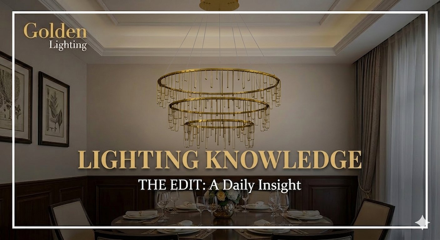
The Final Layer That Makes a Room Complete
You walk into a room with solid furniture, good paint, and the right rug, and it still falls flat. In my years in this business, that usually traces back to one decision. The fixture was treated as a utility item instead of part of the room's architecture.
Light changes how every surface reads. It can sharpen trim details, warm up wood tones, and give upholstery real depth. It also sets the emotional tone of the space, which is why vintage-style fixtures keep showing up in projects that need character without looking overly themed.
The appeal is not only visual. From an operations and product standpoint, vintage-inspired lighting often succeeds because it combines proven proportions with materials and performance standards that work for modern homes. A well-scaled schoolhouse pendant, aged brass sconce, or fluted glass chandelier has staying power. It looks intentional on day one and still earns its place after a remodel, a furniture refresh, or a controls upgrade.
Why vintage style works so well
Vintage style feels grounded because the forms have already stood the test of time. The silhouettes are familiar, the detailing is readable, and the finishes tend to age with more grace than highly novelty-driven designs. That matters in real homes, where fixtures need to live with changing tastes and daily use, not only photograph well.
Character also has to perform.
One overhead fixture rarely gives a room the balance it needs. Good lighting comes from layers that handle general illumination, task visibility, and atmosphere at the same time. Vintage-style fixtures are especially effective here because they carry decorative weight while still fitting into a practical plan. Golden's guide to how to layer lighting is a useful reference if you want to build that mix with more intention.
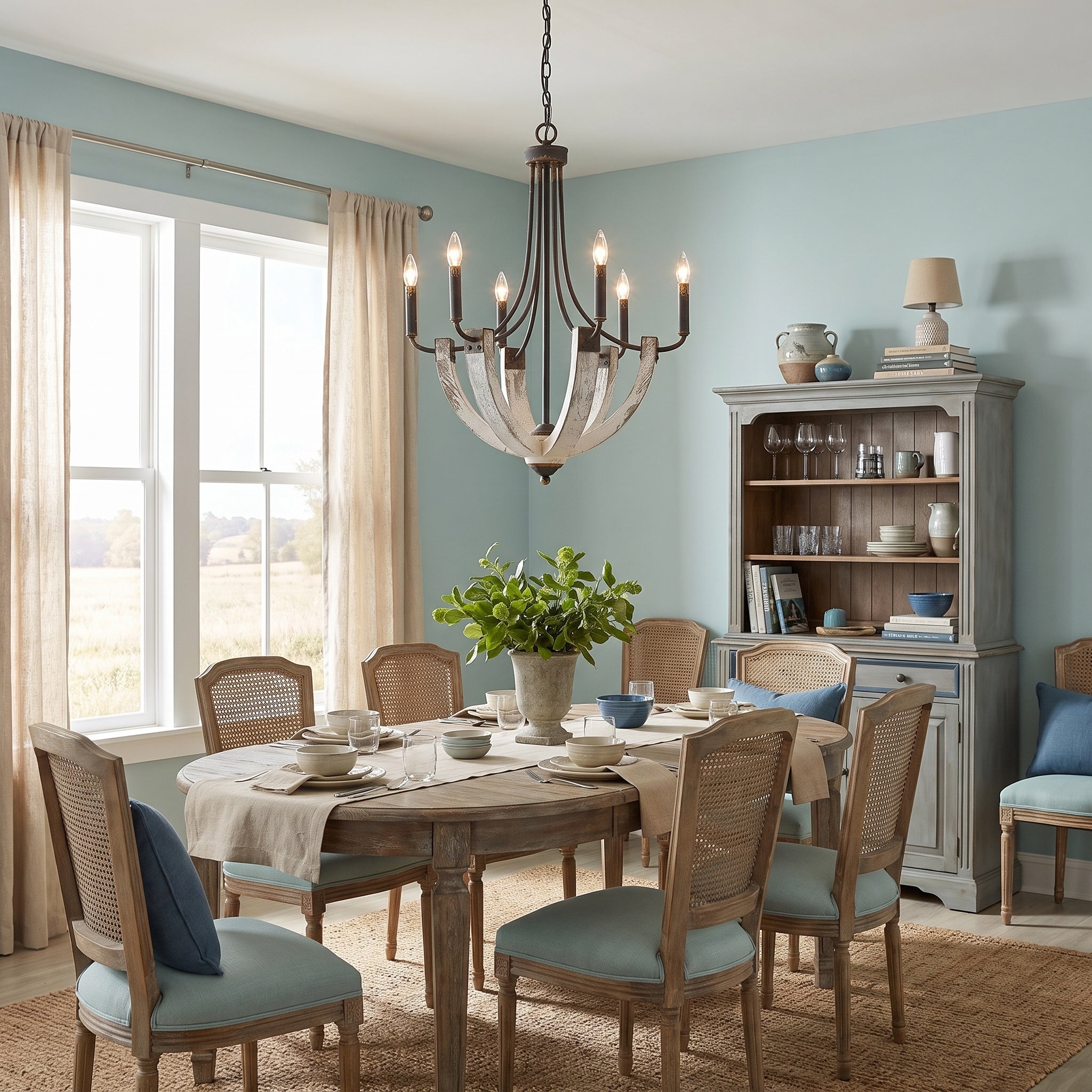
A few examples make the point clear. A pendant over an island establishes focus and helps with prep work. A pair of sconces can give a hallway shape and reduce the flatness that comes from relying only on recessed cans. In a dining room, a chandelier often becomes the visual center that makes the whole scheme feel resolved.
In my years in this business, the best results come from treating vintage lighting as a long-term specification, not a quick style choice. Check dimming compatibility, bulb access, serviceability, and whether the fixture can work with current control systems, including smart home setups. Those details are easy to overlook in the showroom and expensive to correct after installation.
This same mindset applies across the room. Fixtures should relate to the furnishings around them in quality and tone, whether you are pairing them with modern upholstery or curating timeless vintage furniture.
Choose the fixture that finishes the room, supports the way you live, and still makes sense five years from now.
Decoding Vintage Silhouettes and Finishes
People often say they want a vintage light, when what they really mean is one of several very different styles. Getting specific makes selection much easier. Shape, material, and finish tell the story faster than any product tag.

Four silhouettes worth knowing
| Style | What to look for | Best fit |
|---|---|---|
| Early 20th century | Utilitarian shapes, heavier detailing, straightforward construction | Mudrooms, porches, workspaces |
| Art Deco | Geometric lines, symmetry, bronze tones, stepped forms | Dining rooms, bars, dramatic entryways |
| Mid-Century Modern | Organic curves, sputnik forms, lighter visual profiles | Kitchens, living rooms, open plans |
| Retro revival | Playful shapes, bold profiles, expressive glass or color | Creative studios, breakfast nooks, eclectic homes |
A commercial design report noted that 35% of upscale restaurants and 28% of boutiques incorporated vintage pendants or sconces, and it called out Art Deco from the 1910s to 1930s and Mid-Century Modern from the 1940s to 1970s as key reference styles in current use, as summarized in this vintage commercial lighting review.
Finishes that change the mood
The same silhouette can read completely differently depending on finish.
- Aged brass gives a room softness and heritage. It works especially well with cream walls, walnut tones, and opal glass.
- Polished nickel feels sharper and more refined. It suits bathrooms, butler's pantries, and formal transitional spaces.
- Matte black adds structure. It's often the right answer when a room needs contrast more than ornament.
- Bronze and copper tones lean warmer and often feel more period-aware than bright chrome.
For readers pairing lighting with furnishings, a thoughtful reference on curating timeless vintage furniture can help align fixture finish with woods, textiles, and surrounding shapes.
Transitional pieces often make the smartest choice
Not every home needs a strict period fixture. Many spaces benefit more from a vintage-inspired piece with softer edges and broader compatibility. The Dorinda 1-Light Pendant in Brushed Champagne Bronze with Opal Glass is one example. Its transitional design, scalloped opal glass shade, and brushed champagne bronze finish give it a classic profile that fits a wide range of interiors without feeling theme-driven.
For a broader look at shapes and finishes in this category, Golden's article on vintage-inspired lighting provides useful visual context.
A Room-by-Room Guide to Vintage Lighting
A room usually reveals lighting mistakes at the least forgiving moment. Dinner is on the table, the island has shadows across the cutting board, or the vanity casts harsh light that no mirror can soften. In my years in this business, the best vintage-style schemes start with function, then build character on top of it.

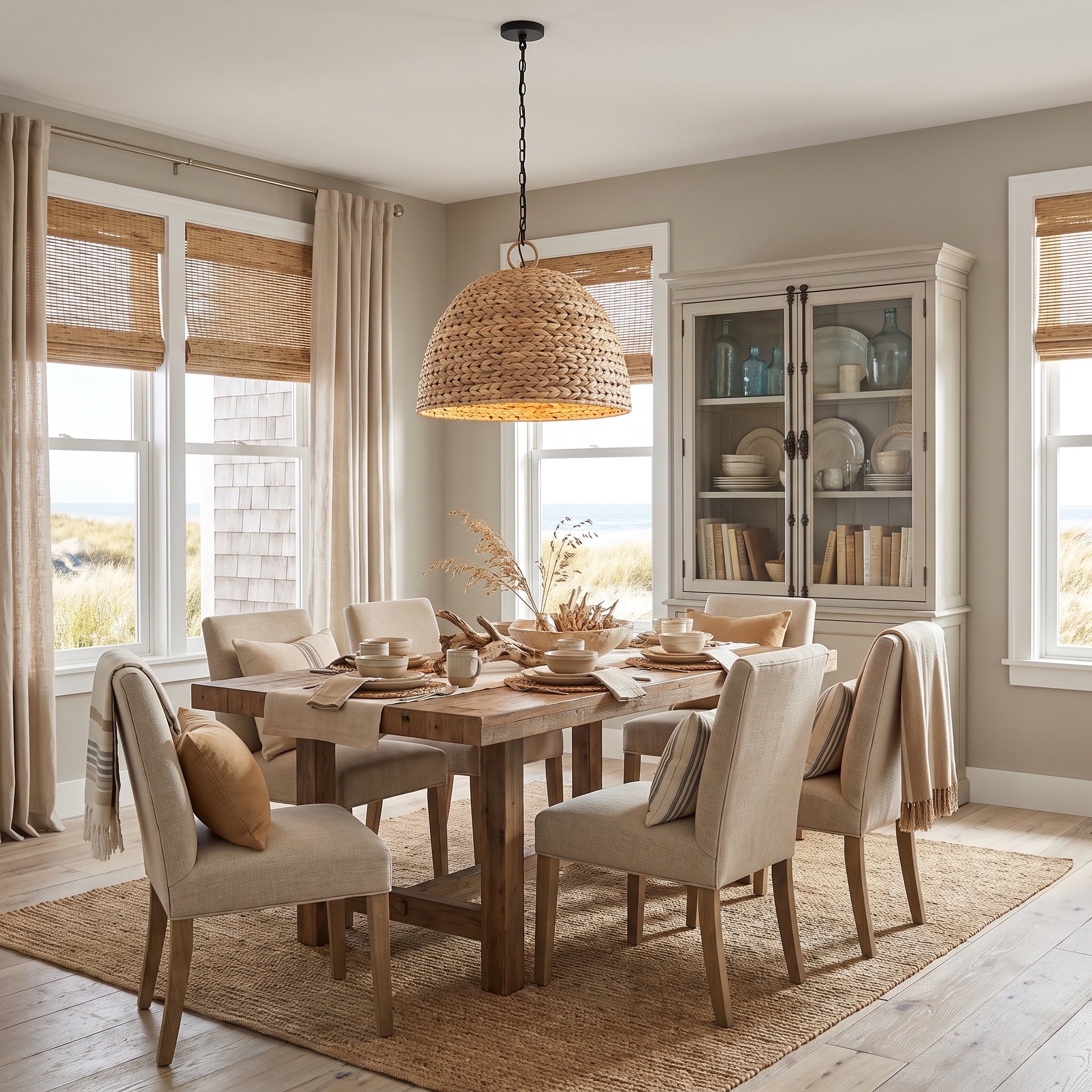
Kitchen and dining spaces
Kitchens reward discipline. Vintage style can absolutely work here, but the fixture has to earn its place with usable light, easy cleaning, and the right visual weight over hard-working surfaces. Pendants with opal glass, compact metal shades, and simple schoolhouse-inspired forms tend to perform well because they direct light downward without turning the island into a visual obstacle.
One practical test helps. Stand at the main prep zone and look across the room. If the fixture interrupts sightlines, throws glare into your eyes, or leaves the counter patchy, the silhouette is wrong no matter how attractive it looks in a showroom.
Dining rooms require a specific type of presence. The fixture must command attention whether the table is set or empty. Art Deco lines, refined chandeliers, and Mid-Century forms all perform effectively in this space because they provide structure without appearing overly ornate. Height is just as important as aesthetic choice. For a helpful reference on optimal dining fixture height, use the table as the visual center and adjust from there.
This short video is useful for seeing how decorative and functional lighting work together in lived-in spaces.
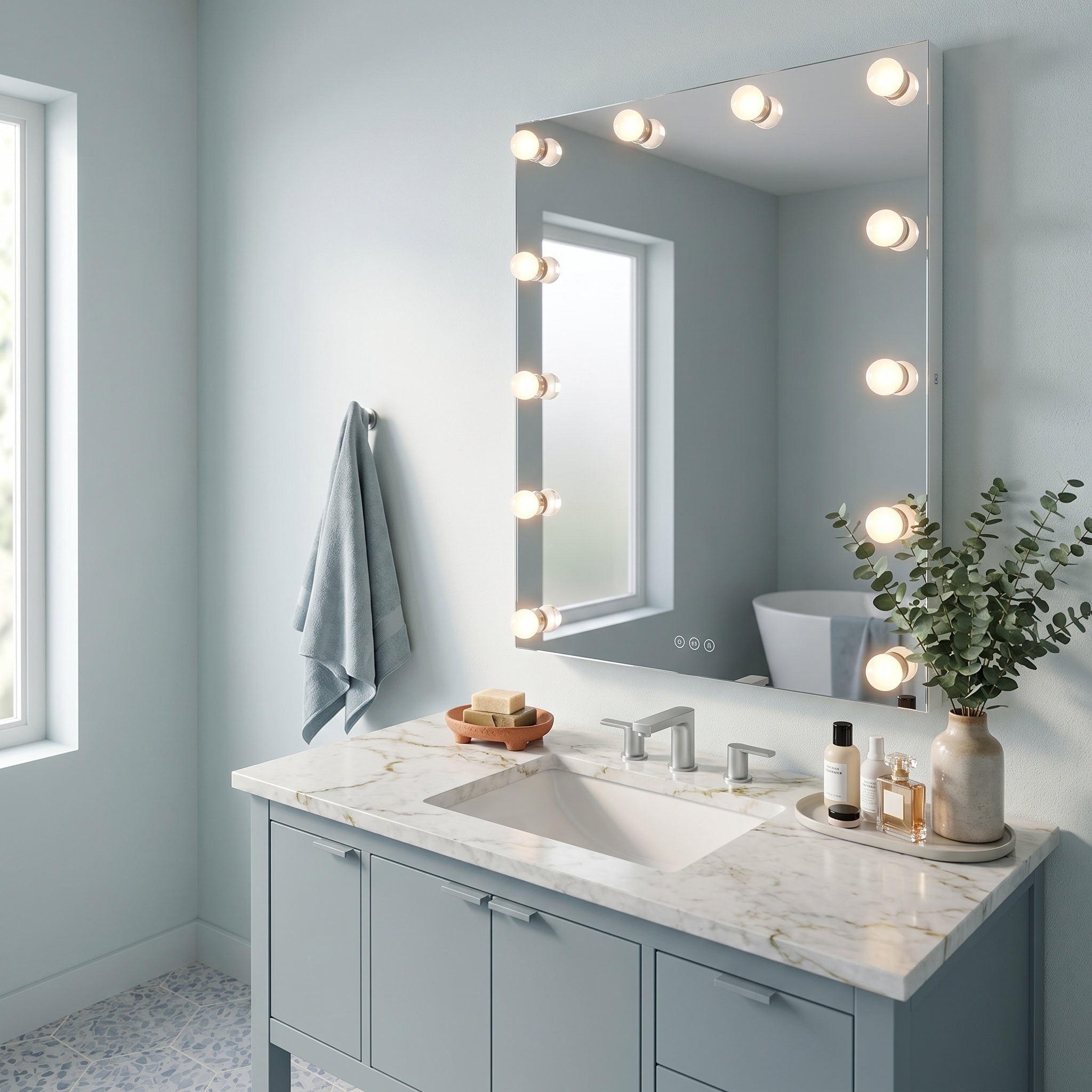
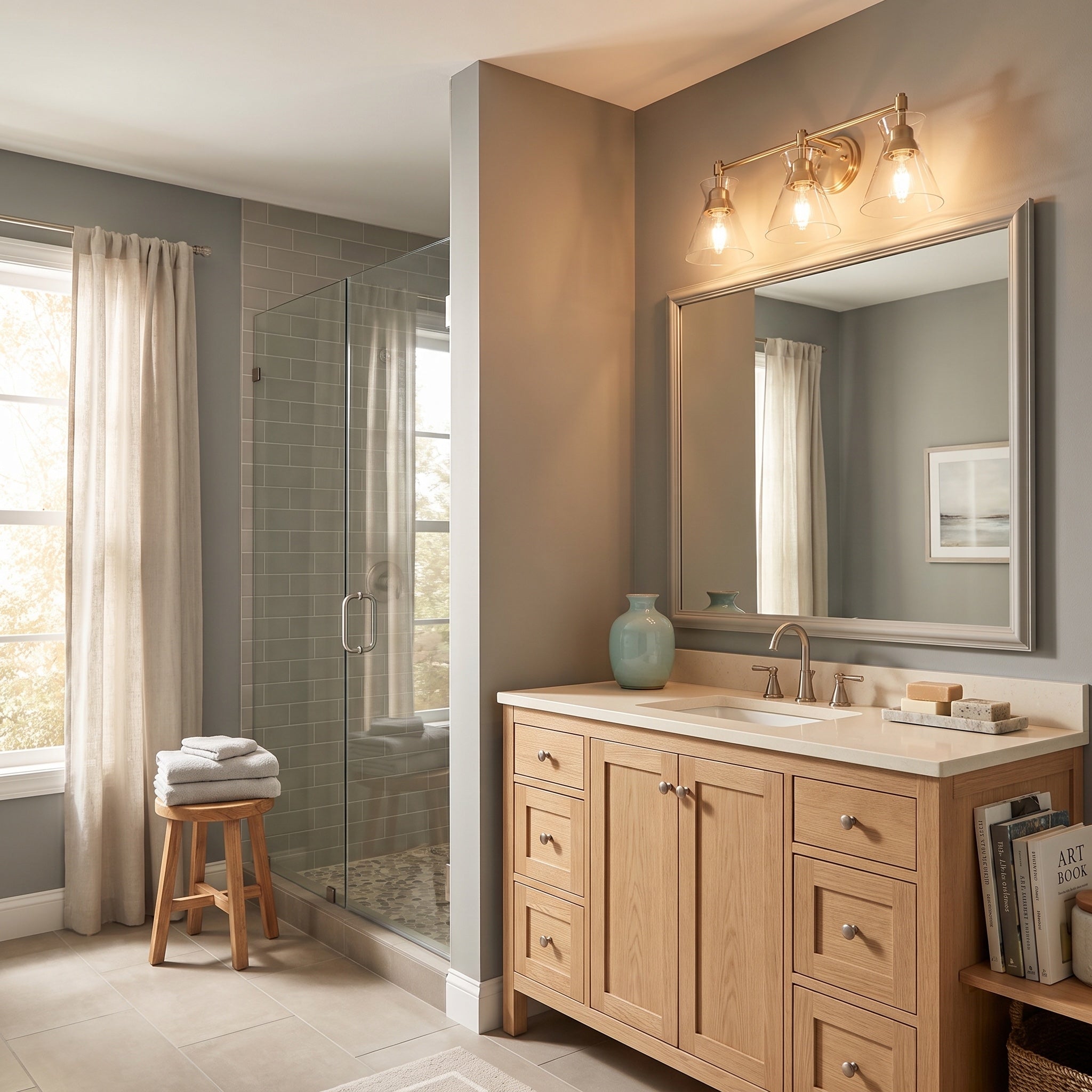
Bathrooms and entryways
Bathrooms benefit from vintage influence because it softens a room full of hard surfaces. The best choices usually combine diffused glass, clean metalwork, and forms that are simple to wipe down. A two-light or three-light vanity fixture with opal or etched glass often gives a more flattering result than exposed bulbs, especially in smaller baths where glare becomes part of the daily routine.
Entryways have a different job. They set the tone of the house in seconds. A lantern, compact chandelier, or semi-flush mount with vintage cues reads clearly from the front door and still feels appropriate in daylight. In my years in this business, this is also where build quality starts to matter in a very visible way. A foyer fixture hangs in open view, so thin plating, weak proportions, and poor glass fit show up quickly.
Living rooms and bedrooms
Living rooms work better with layers than with a single statement fixture carrying the whole load. A vintage-inspired flush mount, chandelier, or pendant can establish the room's identity, but lamps and sconces make the space usable after sunset. That mix also gives more flexibility for dimming, zoning, and smart controls, which matters in homes where one room shifts from reading to entertaining to television.
Bedrooms follow the same logic, with a little more restraint. Ceiling light handles dressing and general visibility. Bedside sconces or small pendants create a calmer atmosphere and free up table space. For shoppers comparing options, browsing pendant lighting and chandelier styles side by side helps clarify which rooms want a focal point and which need quieter support.
If you want a practical framework before choosing sizes and mounting positions, Golden Lighting's guide on how to size and place your light fixture is a useful reference.
The Rules of Right-Sizing and Placement
Bad scale is the fastest way to make an expensive fixture look wrong. Too small, and it disappears. Too large, and it takes over the room before anyone notices the furniture.
The good news is that sizing doesn't need to be mysterious. A few simple rules handle most residential spaces.

Three sizing rules that hold up
- Start with the room. Add the room's length and width in feet. Use that total as a guide for fixture diameter in inches. A 10 by 12 foot room points toward a fixture around 22 inches wide.
- Match the table, not just the room. Over a dining table, the fixture should usually be about one-half to two-thirds the width of the table. That keeps the light visually connected to the furniture beneath it.
- Adjust for taller ceilings. For ceilings above standard height, add length to the fixture or suspension so it doesn't look undersized in the vertical plane.
Placement matters as much as size
A centered fixture only works when it's centered on the thing that matters. In a dining room, that's the table. In a foyer, that may be the visual center of the volume. Over an island, pendants should align with the island, but not with the ceiling box a builder happened to place.
For dining rooms specifically, this guide to optimal dining fixture height is a useful reference for checking suspension before final install.
Ceiling height changes how people read scale. A fixture that looks perfect on paper can still look too short if the suspension isn't adjusted to the room.
Pro-Tip for tricky ceilings
Pro-Tip
In rooms with extra-high or sloped ceilings, choose a fixture with a strong silhouette before worrying about decorative detail. Height tends to dilute small ornament. Clear geometry, a defined frame, or a distinct glass shape will read better from the floor.
Installers and designers who want a dependable baseline can use Golden's guide on how to size and place your light fixture as a working reference.
Bringing Vintage Style into the 21st Century
A vintage look shouldn't lock a home into vintage performance. The strongest installations today pair classic forms with current bulb technology, better dimming behavior, and smarter controls.

Choose bulbs for atmosphere, not nostalgia alone
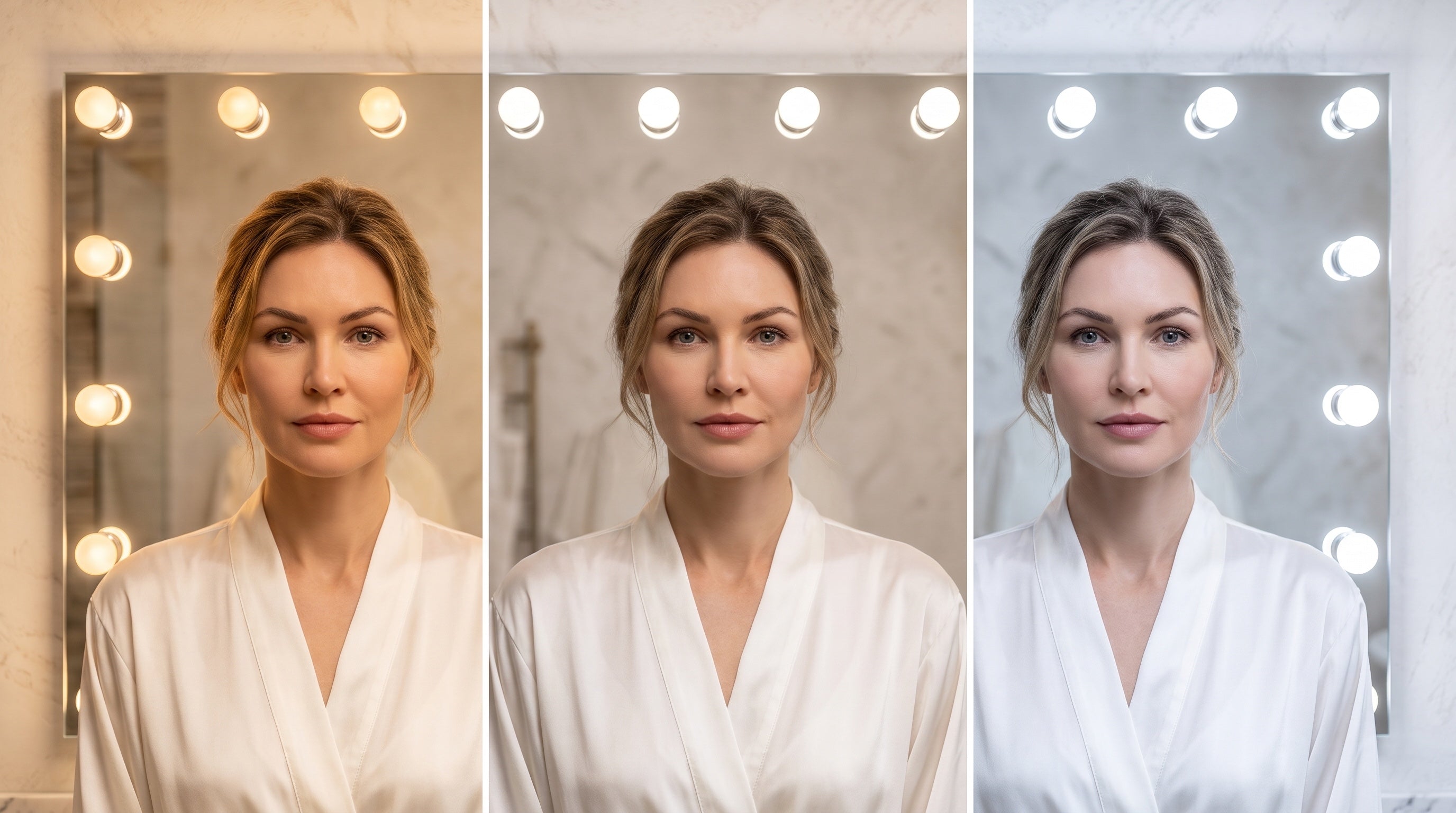
Retro-style LED bulbs can preserve the look people want while improving everyday function. For a warm vintage feel, bulb color temperature typically falls in the 2200K to 3000K range, with 2700K serving as a common benchmark for incandescent-like light, according to PacLights' review of retro vintage bulb metrics.
That warm range works especially well with aged brass, amber tones, walnut furniture, and opal glass. It's less successful in utility zones where a crisper task light is needed. The fixture can stay vintage in character even if the bulb choice becomes more practical.
Smart compatibility is no longer optional
This is the area many style articles ignore. Homeowners increasingly want vintage silhouettes that work with app control, voice control, and tunable routines. A 2025 Houzz report found that 62% of homeowners renovating lighting sought smart-compatible vintage designs, and searches for “vintage smart lighting” rose 35% in the last year, as noted in this summary of the smart-vintage gap.
That demand changes how fixtures should be specified:
- Check socket and bulb compatibility: some vintage-style forms are easiest to modernize with smart-compatible replacement bulbs.
- Confirm dimmer pairing: mismatched dimmers can cause flicker and poor low-end performance.
- Think about daily use: bedside pendants, kitchen islands, and entry fixtures benefit most from scheduled or voice-based control.
For readers tracking broader home aesthetics around this shift, these upcoming design trends for 2026 give helpful context on why heritage forms and modern systems are converging.
One practical example is Golden Lighting, which offers vintage-inspired and customizable fixture lines that can be specified with current bulb and control strategies, rather than requiring homeowners to choose between style and modern function.
Styling Secrets for a Cohesive Look
A room usually falls apart in the last 10 percent. The sofa works, the rug works, the millwork is strong, yet the space still feels unsettled once the lights go on. In my years in this business, that gap usually comes from poor coordination, not a lack of style. Vintage-style lighting brings enough character on its own. The job is to connect it to the room with restraint.

For homeowners who want timeless rooms
Start with one anchor fixture and let it set the tone. A brass pendant can relate to cabinet hardware or a mirror frame. A milk-glass vanity light can connect to a ceramic lamp or a glossy tile finish. Repetition creates calm, but too much matching makes a room feel bought in a single afternoon.
Good cohesion also depends on restraint in the supporting pieces. If the chandelier has a strong profile, keep nearby lamps visually quieter. If the sconces carry decorative flourishes, let the surrounding materials do less. Vintage style holds together best when one or two ideas repeat across the room, such as a finish, a curve, or a glass type.
For creatives who like to personalize
Mixing styles works better when the room follows a clear rule. Keep the finish consistent and vary the silhouettes. Or repeat a shared shape, like a dome or cone, across different materials and scales. That gives the room personality without visual drift.
A few combinations work reliably:
- Repeat one finish: aged brass, matte black, or polished nickel can keep the mix intentional.
- Change one texture: pair opal glass with clear ribbed glass, or metal fixtures with a nearby fabric shade.
- Use asymmetry with purpose: an off-center pendant or mismatched bedside pair can feel collected if the visual weight still balances across the room.
The practical side matters too. Custom-looking rooms still need fixtures that are easy to relamp, clean, and dim properly. A beautiful composition loses its appeal fast if one pendant throws glare or the bedside lamp is awkward to reach every night.
For design professionals specifying refined spaces
Higher-end projects ask more from a fixture than visual impact. Finishes need depth, not just color. Glass needs weight and clarity. Proportions have to read correctly against tall ceilings, stone surfaces, and detailed millwork. Those details separate a fixture that photographs well from one that still looks right five years later.
I also look at continuity across the full lighting package. An entry lantern, dining chandelier, and hallway sconces do not need to match, but they should agree on period language and build quality. That is why product families and customizable lines can be useful specification tools. YEP by Golden supports personalization across layouts, while Ziva by Golden fits projects that call for a more showroom-driven expression. Both work best when selected as part of a larger visual system, not as isolated statement pieces.
Better materials improve appearance, but they also protect long-term value. A well-built vintage-style fixture can stay relevant through several paint colors, furniture plans, and control upgrades. That staying power is what makes a cohesive room feel finished instead of merely styled.
How to Specify and Source with Confidence
A fixture should earn trust before it earns attention. Good styling can't rescue poor construction, unsafe electrical components, or thin finishes that fail early. Sourcing well means looking past the photograph.
What deserves a closer look
Use this checklist when comparing options:
- Safety listing: Look for UL-listed or equivalent compliance details when a fixture is being installed in a permanent residential setting.
- Material honesty: Solid-feeling metal, well-fitted glass, and clean joins usually tell more than trend language ever will.
- Serviceability: A fixture should allow reasonable bulb changes, cleaning access, and replacement of wear components when needed.
- Finish practicality: Kitchens and baths demand surfaces that can handle routine wiping and humidity.
Sustainability is part of value
Sustainability is no longer a secondary concern. A 2025 Lighting Research Center study found that 47% of U.S. consumers prioritize sustainable lighting, and it also noted that true vintage fixtures can carry a 40% higher embodied carbon footprint than quality reproductions using modern, efficient manufacturing and materials, as summarized in this sustainability discussion on vintage lighting.
That creates a real trade-off. An authentic old fixture may offer unmatched historical character. A well-made reproduction may be the smarter fit for performance, sourcing transparency, and long-term maintenance. The right answer depends on the project, but the question should always be asked.
Confidence comes from clarity
Buyers should know what they're getting. Fixture type, dimensions, bulb type, finish, and installation context need to be clear before the order is placed. If that information is vague, the risk shifts to the homeowner, designer, or installer.
For the next step, browse the fixture categories that fit the project, review specification details carefully, and find a showroom near you if the space calls for an in-person look before final selection.


Share:
Elevate Your Home With Farmhouse Exterior Lighting
Outdoor Post Light Installation Made Easy