


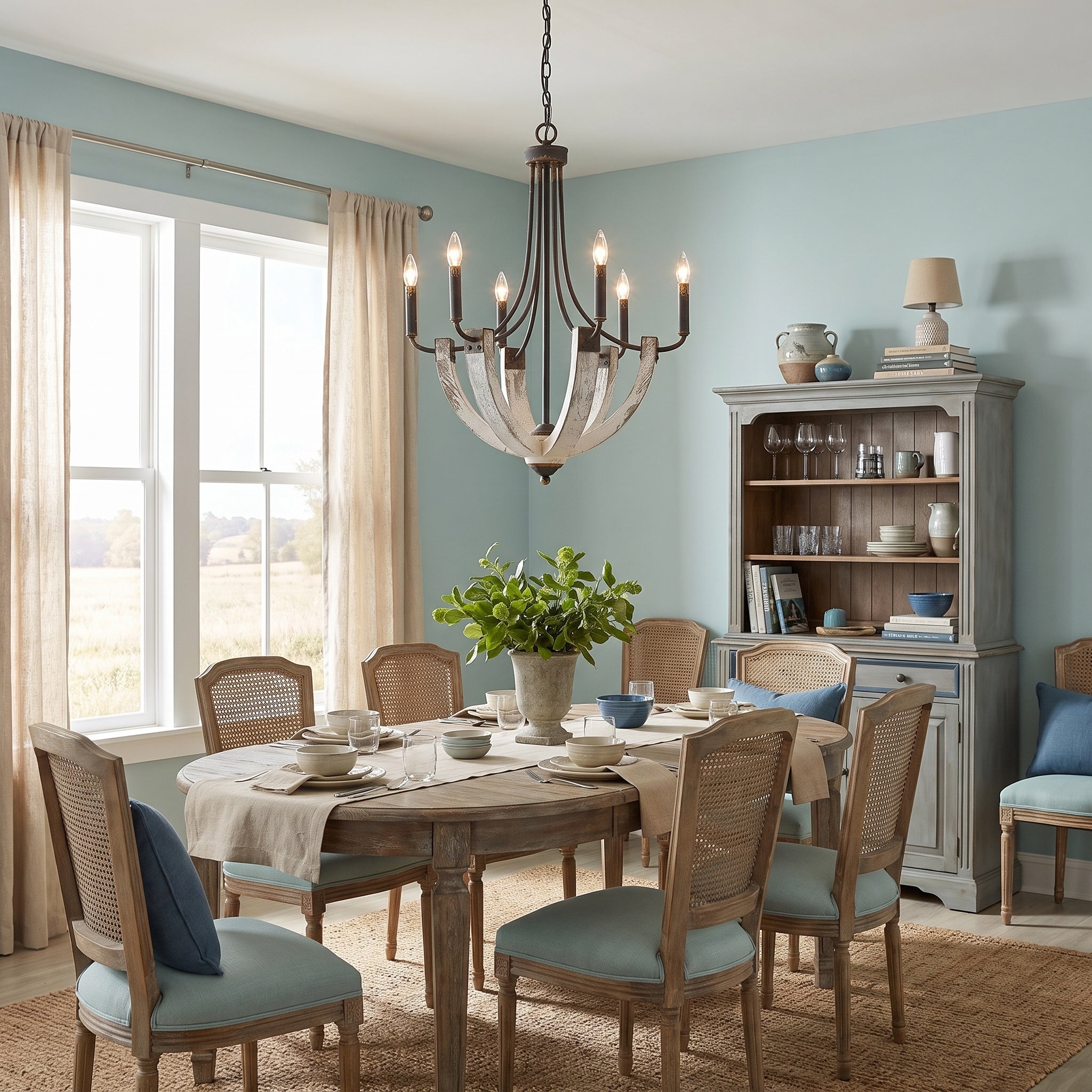
Search "how bright should my dining room be" and you'll find answers spanning a threefold range — because most articles recycle each other instead of reading the standard. Here's what the IES/ALA residential lighting standard (ANSI/IES RP-11-26) actually recommends, translated into decisions you can make.
The dining numbers, from the source
The standard's illuminance tables treat the entire tabletop as the task surface, and recommend (as maintained averages on the table):
- Formal dining: about 5 footcandles — a low, glowing level that flatters food and faces
- Everyday/informal dining: about 10 footcandles — bright enough for homework and board games
- Study or work use at the table: about 20 footcandles
(One footcandle ≈ 10.8 lux, if your smart-home app speaks metric.)
Notice what this means: a formal dining room needs far less raw light than most people install — what it needs is control. Which brings us to the most useful upgrade in the room:
Dimmers are the whole game
The same table serves candlelit anniversaries and tax preparation. The standard's answer — and ours — is dimming: set the fixture for the brightest task the room hosts, then dim to the mood. Every Golden Lighting fixture is dimmable as a company standard, so the capability is built in; pair it with a compatible dimmer and the one fixture becomes five different rooms. (Code note: on stairways with switches at multiple levels, dimmers are only permitted when full brightness is reachable from every switch — safety outranks mood on the stairs.)
Warmth: the 2700–3000K sweet spot
For living and dining spaces, warm white in the 2700–3000K range is the consensus recommendation — the warmth of classic incandescent light, universally flattering to skin, food, and wood tones.
Two multipliers people forget
Age. The standard is blunt: older eyes need roughly 3 to 5 times more light than younger ones for the same task, delivered evenly and without glare. If a room serves grandparents and grandchildren alike, design for the eyes that need more, and dim for the ones that don't.
Your walls. Light doesn't just come from fixtures; it reflects. The standard recommends high-reflectance ceilings and light-to-medium walls precisely because dark surfaces swallow light — a navy dining room can need dramatically more lumens than a cream one to hit the same brightness on the table. If you're going dark and moody (we love it too), budget more light output and lean harder on the dimmer.
Comfort is contrast, not just brightness
One more insight from the standard that separates pleasant rooms from harsh ones: comfortable lighting keeps contrast bounded — the brightest and darkest areas of your field of view shouldn't be wildly far apart. In practice: no blinding hot spots, no cave-dark corners, and light that graduates gently outward from the table. A room can be dim and comfortable, or bright and harsh; contrast is the difference.
And at night, think low and warm: the standard recommends low-mounted, amber-toned night lighting for pathways, so midnight navigation stays easy on the eyes.
Numbers cited from the illuminance recommendations of ANSI/IES/ALA RP-11-26, the recommended practice for residential lighting. Dimmability reflects Golden Lighting's company product standard.
Share:
The Best Lighting for Makeup: Color Temperature, CRI, and Brightness Explained
What Size Chandelier Do I Need? The Sizing Rules Designers Actually Use